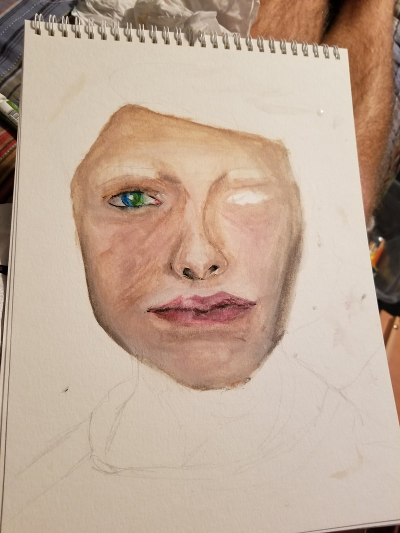
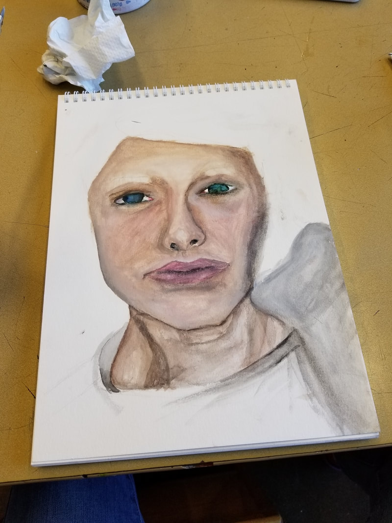
Scholastic 144 (selfie) 9/21/17
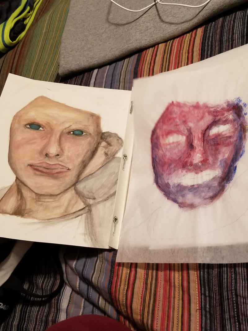
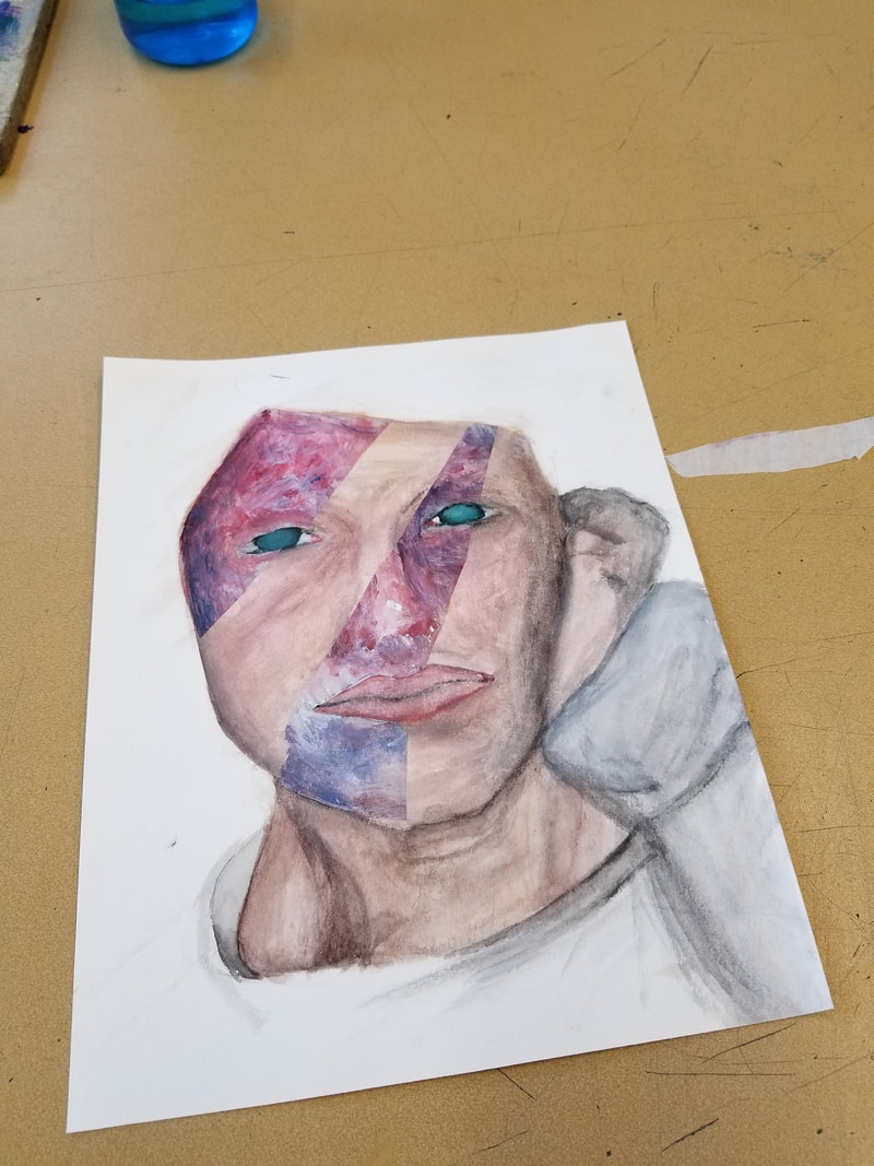
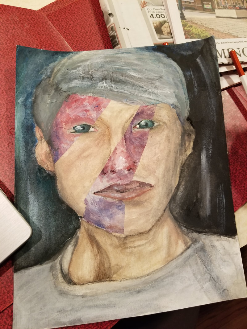
My original idea was to make a self portrait was nothing like what actually came out of this project. My original idea was to take an old but recent school photograph and repaint it with watercolor, then scratch the face out of it. What actually happened was me sitting in my bed, painting a self portrait for fun until I spent four and a half hours on my face and the proper colors for my skin tone.
The process of my assignment was very difficult. I worked on it every day and it seemed like it was missing something. At first, it was just plain boring self portrait of my face made from water color. It really didn't look like me. I then almost gave up and started all over again but I did a practice painting on a piece of wax paper and I eventually made the bold decision to use matte medium and combine the parts of the wax paper onto my face and make it more abstract. As well as the hair which was matted on to make a collage. I also struggled with my arm and hand because it didn't really look like a hand so I just got rid of it with water color and acrylic paint and create a darker background with scumbled strips of white acrylic paint.
The process of my assignment was very difficult. I worked on it every day and it seemed like it was missing something. At first, it was just plain boring self portrait of my face made from water color. It really didn't look like me. I then almost gave up and started all over again but I did a practice painting on a piece of wax paper and I eventually made the bold decision to use matte medium and combine the parts of the wax paper onto my face and make it more abstract. As well as the hair which was matted on to make a collage. I also struggled with my arm and hand because it didn't really look like a hand so I just got rid of it with water color and acrylic paint and create a darker background with scumbled strips of white acrylic paint.
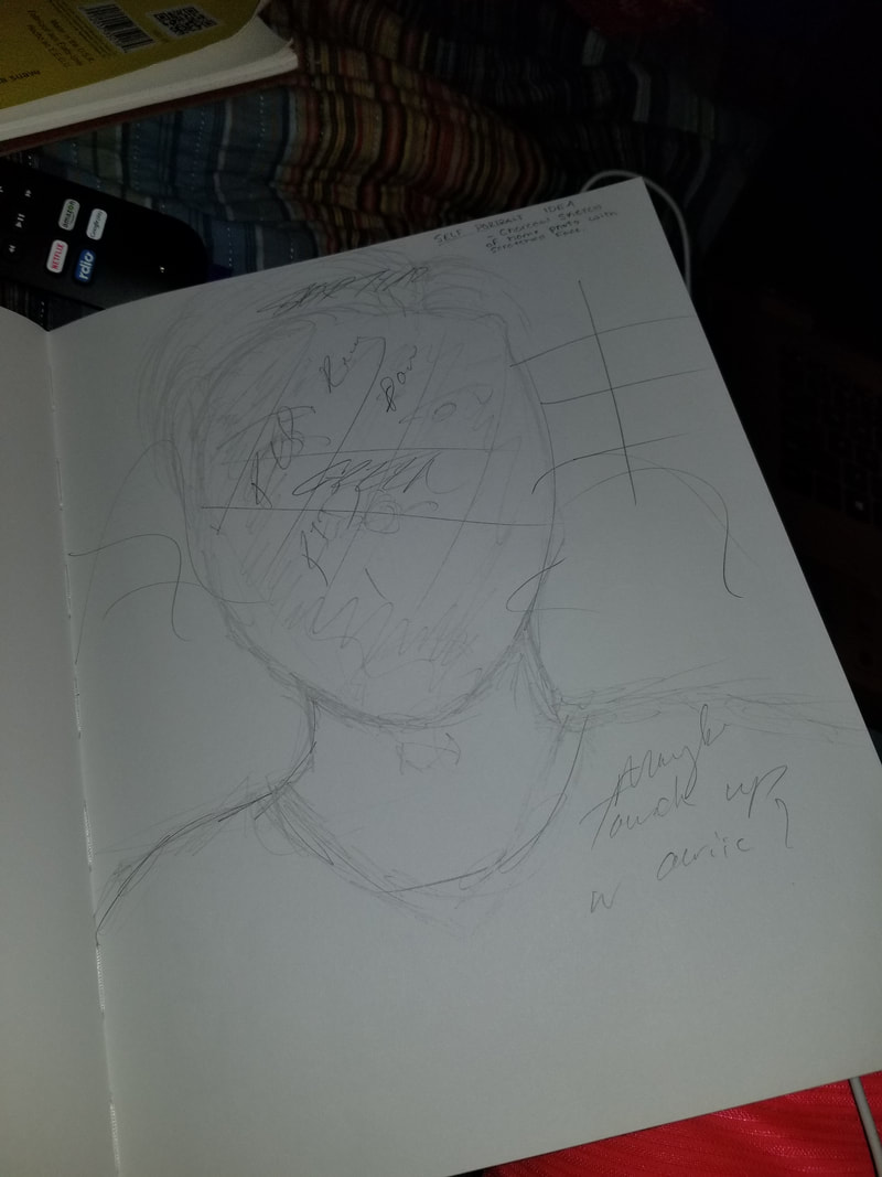
Metamorphosis
10/2/17: Right now I am currently taking large rolls of paper and trying to figure out what I am going to set up and how this is going to work. My idea is having the metamorphosis of emotion by using human faces. My problem is I'm not sure how I'm going to get the layout of the faces be a giant clutter of scribble sketches.
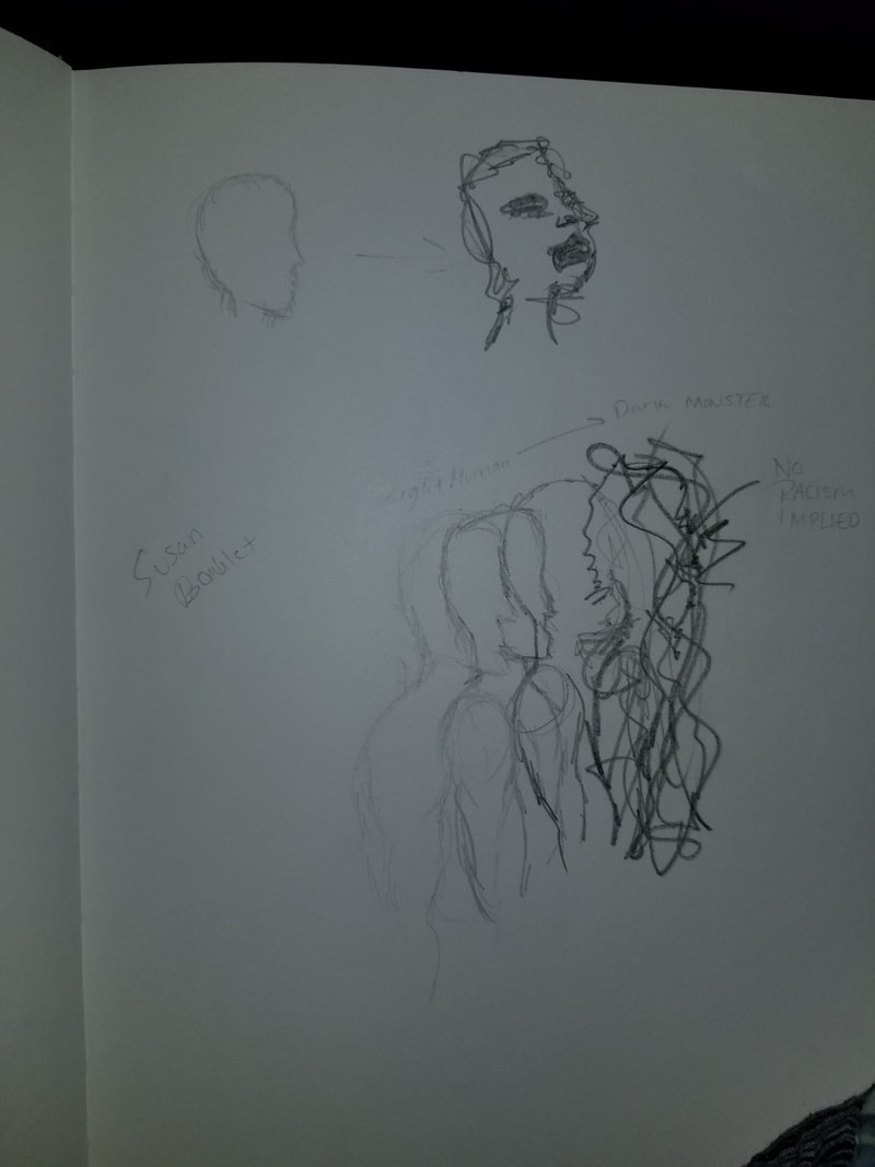
10/4/17: Hey! I'm back and started a new thing. Maclay and I have decided to make a collage and matte medium all of my sketches, ripped up, and place them onto a giant piece of water color paper. I first put gesso onto the paper, then I used matte medium to place the sketches onto the paper. I then placed a light coat of gesso on top of it to cover the collage up but also be able to see it if you look at it.
10/7/17: Today was a studio day and I had 3 hours to work and figure out how I'm going to get the metamorphosis of emotion onto the paper. I chose my idea from my sketches and started sketching a face with a 4H graphite pencil while looking into a mirror and focusing on the lines of a face. I then grabbed a red color pencil and started to sketch another face of anger. Then I grabbed a blue colored pencil and sketches my face trying to be sad.
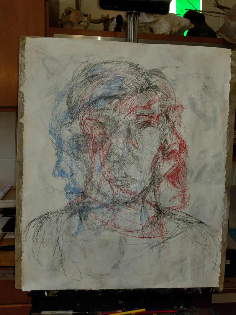
10/11/17: Over the past couple days I have been working on this noticing that something is missing and it needs to have more work on it. Mrs. Maclay has been a huge help pushing me and getting out of my comfort zone in sketching she told me to add more face. I had no idea how I was going to do it but then we decided a place and I added three more faces. I placed one in the center with a yellow so there was all primary colors. Then I made the face on the left with a red color because the red was very powerful and I wanted it to even out.
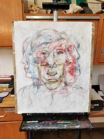
I look at this and I'm okay with it. I feel like I could've have done a lot more things to this to make it more appealing because its very complicated in a way. I believe I got my point across of make the person know the feelings which was one of my goals for the assignment. I wanted people to feel something when they look at it. I also wanted to make them think so they would have to stare at it to figure out what's going on. I have touched his up a bit but I currently do not have an image yet. I am still waiting to matt it because I don't have a big enough paper for it yet.
Social Commentary
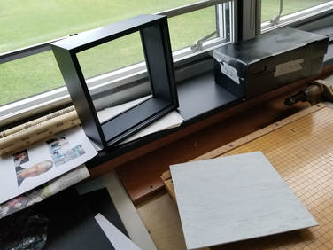
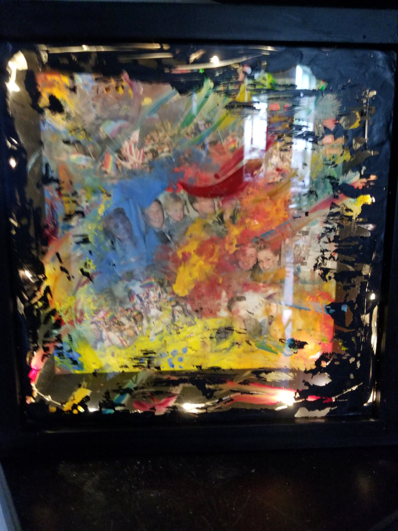
10/7/17: So I started planning for social commentary and planning out a big issue and how I can show how it's powerful to the world. I chose homophobia due to personal reasons and how the homosexuals are just like normal people and they're fighting and breaking rules for rights. My original idea is unrealistic by running into a tin sheet and getting the human for pushing through a barrier representing the fight and not giving up. But instead I purchased a shadow box and I'm now planning a way to represent the world of pride, etc.
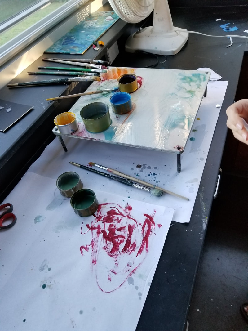
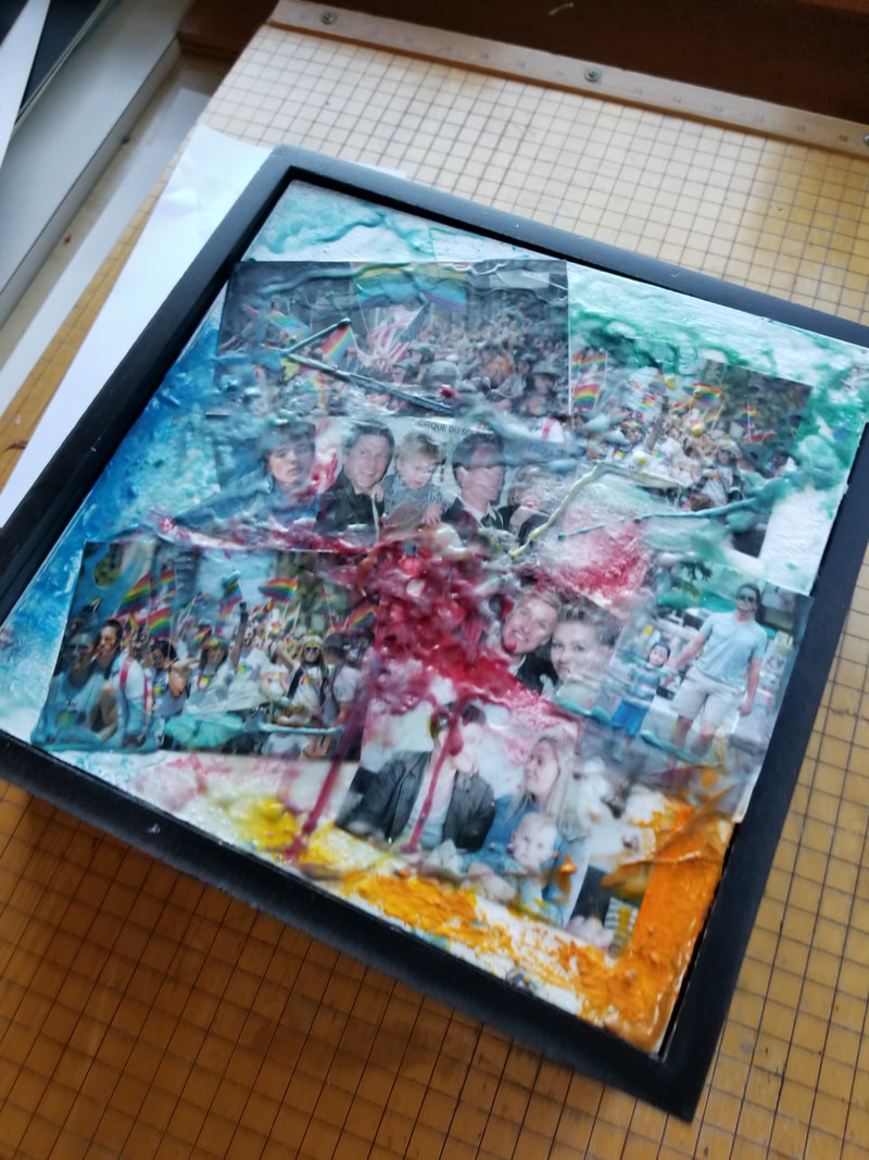
10/17/17: It's been like 10 days for me to continue to do my metamorphosis and figure out what is going to happen with my shadow box. I now have a shadow box ready and I printed out images because I'm getting ready to make a collage with something new. I will be collaging images of gay families and colorful this to represent homosexuality and how it's fight it's was through the normality of homophobia. I just had a demo and I'm getting ready to start it with encaustics! Pretty exciting right? I first have to gesso over the board of the shadow box and keep the rigid texture.
10/18/17: Today I actually got a lot of collaging done with the wax from the encaustics and a heat gun. This is completely new and it's kind of fun. at first it made a really rigid texture and then the heat gun really smoothed the colors out. I tried to get the colors of the rainbow with the wax to collage the images on and add color to the piece.
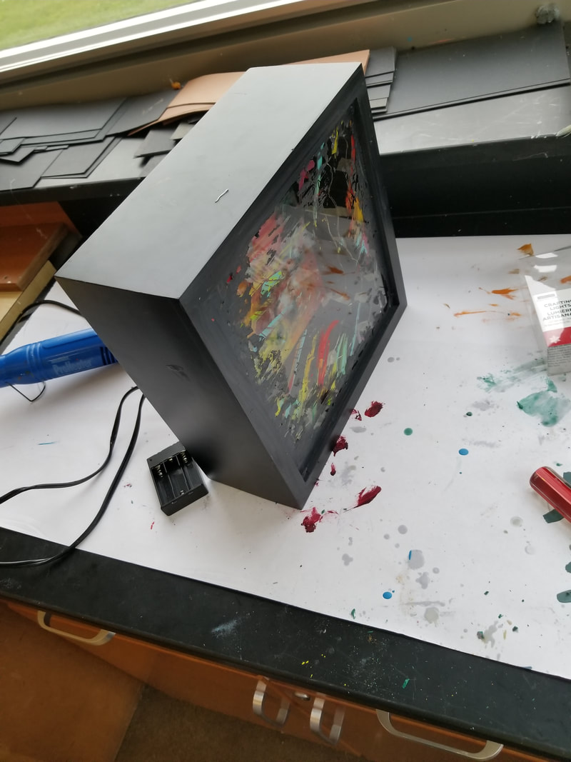
10/23/17: Over the weekend I got battery powered LED light to light up the inside of the box and I place them inside. I first tried to staple them in and that didn't work very well. Then I tried using tacks. That didn't work either. I then had to give in and use tape to place them around the border of the box. Then I lit them up and closed it and it was literally "lit."
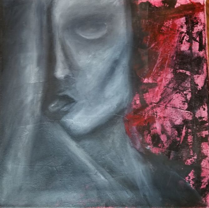
Identity
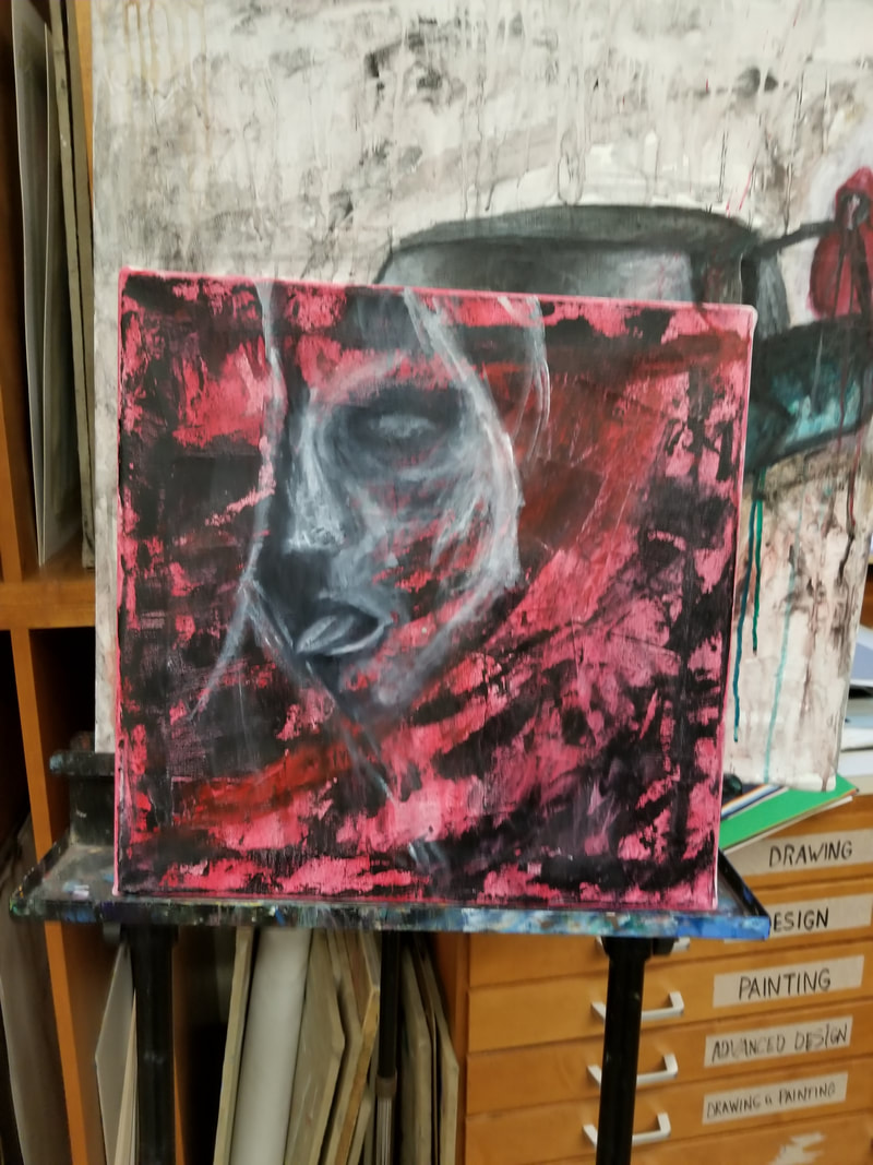
Planning: My planning for identity is a figure or face drawing with an abstract twist but with the revealing of inner darkness inside and I plan on doing this on a large canvas and working ways out to show the inner identity of a figure.
Tim Hoovers Work
|
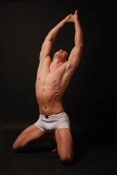
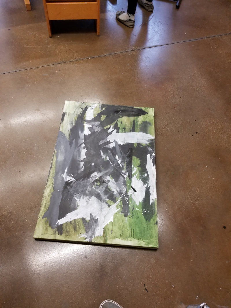
So, my idea has changed a good amount of from my original idea. It's relatively similar. I had done some research on how to express emotions to relate to an identity and have came across this image because it's very expressive and very different. The artists who inspired are Pollock and Tim Hoover. Tim Hover is an artist from Carlisle Pa, and his style is very abstract and clean and I really enjoy his work.
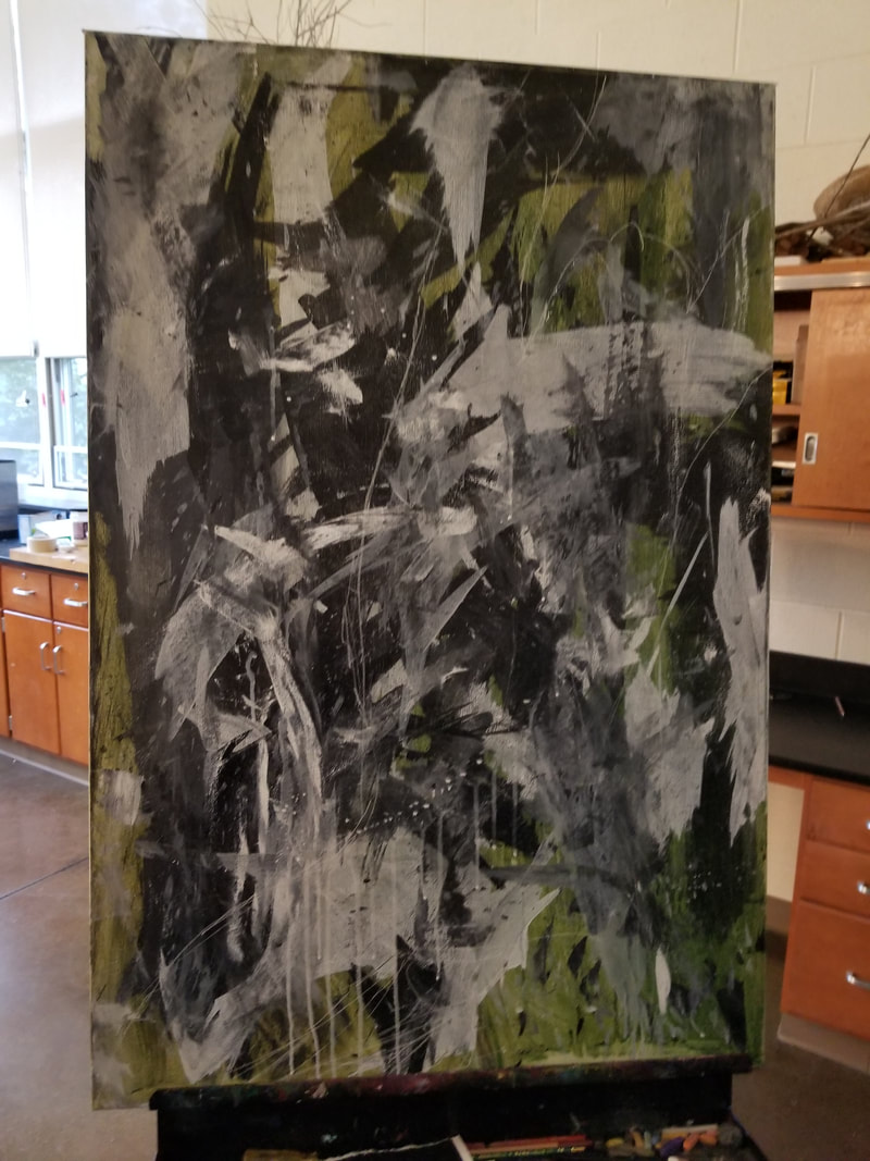
I started by getting this giant canvas I brought from home. then I started painting a green underpainting just n case I did flesh colors. I didn't start with the figure but I started with black and white abstract patterns and while I do that, I try to express my feelings through the strokes. I used knife the spread the paint and matt board to create a variety of abstraction. The next day I finished up the back round and projected the image of the male onto the canvas. I sketched the outline of the image and I'm currently adding an under painting for the body and figure in black in white. I'm not sure if I'm going to keep it black and white or do flesh colours yet but we'll find out soon! |
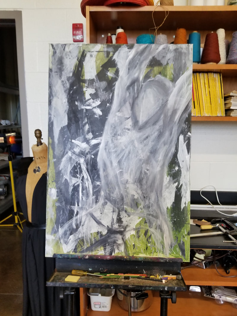
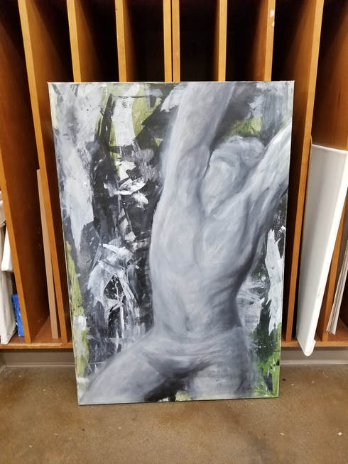
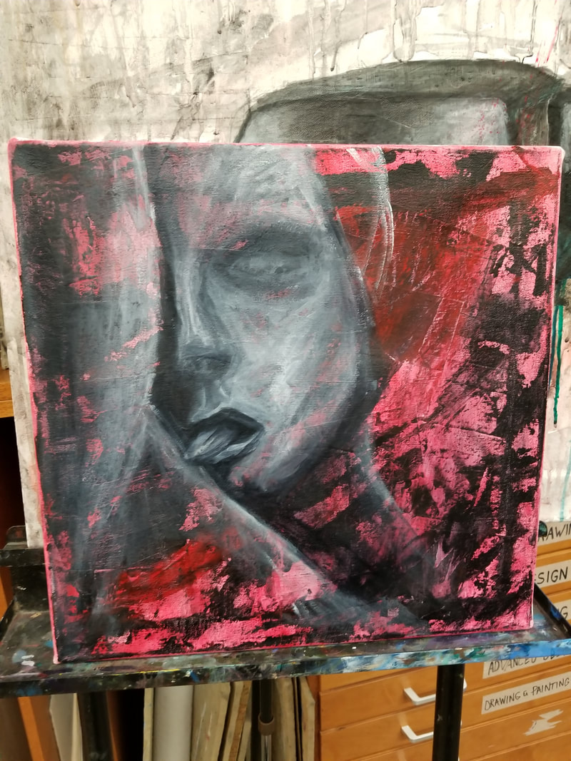
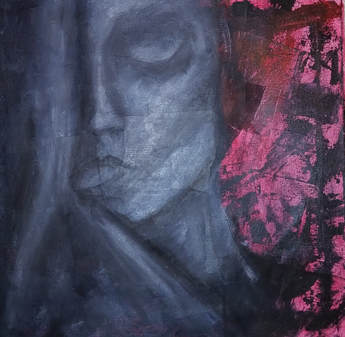
After a week or two working on this painting I thought it was missing something. I tried to make the abstraction and realism have a balance between the two. I decided to call it after doing a few touch ups and fixings but I'm still unsure if I am 100% finished but I took a long time on this one to try to make it seem "right." Honestly I realized it's never going to be perfect like I wanted it to. The movement and unity in it makes it seem like an locked up and unknown identity.
Observation
my idea for this is to try a new thing and do a dyptic or tryptic with photography and maybe painting. I'd have one image I's take and I would paint it in different ways and my abstract style.
11/20: So it's two weeks later and I recently completed my identity assignment. I shouldn't admit to half of this but my friend and I had went to a creepy road to take photographs of sketchy object and scenes. We drove around and we found a bridge and took a few amateur photographs.
11/20: So it's two weeks later and I recently completed my identity assignment. I shouldn't admit to half of this but my friend and I had went to a creepy road to take photographs of sketchy object and scenes. We drove around and we found a bridge and took a few amateur photographs.
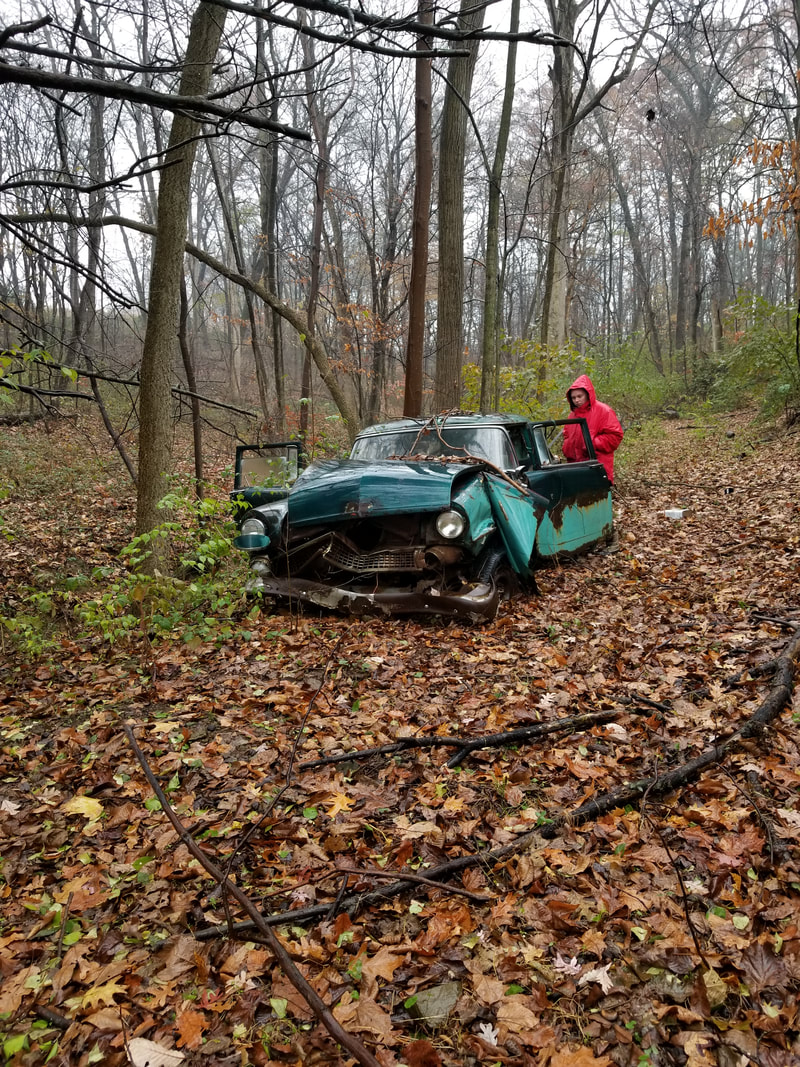
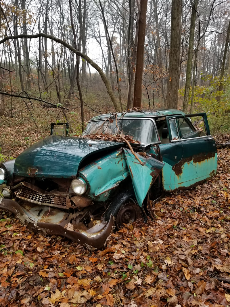
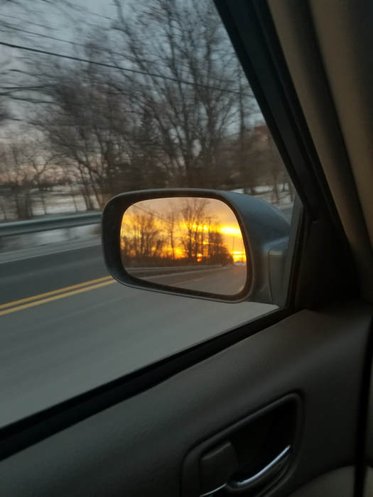
My friend decided to wear a red rain jacket and at first it was a joke, but then I had another photograph of her and wanted to use the red coat as, like the subject for the paintings in the observation. It would really bring emphasis on it because the color is bright compared to everything else it would just unify together.
I finally started the painting and I have no images yet but it needs a lot more work but I'll out images up soon so you'll see how it turns out soon. I am using aqr
I finally started the painting and I have no images yet but it needs a lot more work but I'll out images up soon so you'll see how it turns out soon. I am using aqr
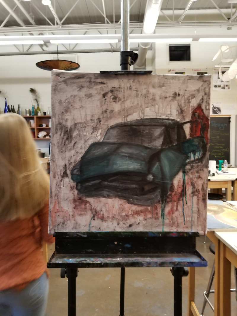
I am having a lot of problems with this. I'm just trying to paint this photograph with a different style and it keeps fighting me. I use way too much line and outline everything. I swear I painted over the car 20x. I keep pushing this to the side because it just makes me frustrated because the background and the car are two different styles and I'm just trying to unify the two and it is not working out.
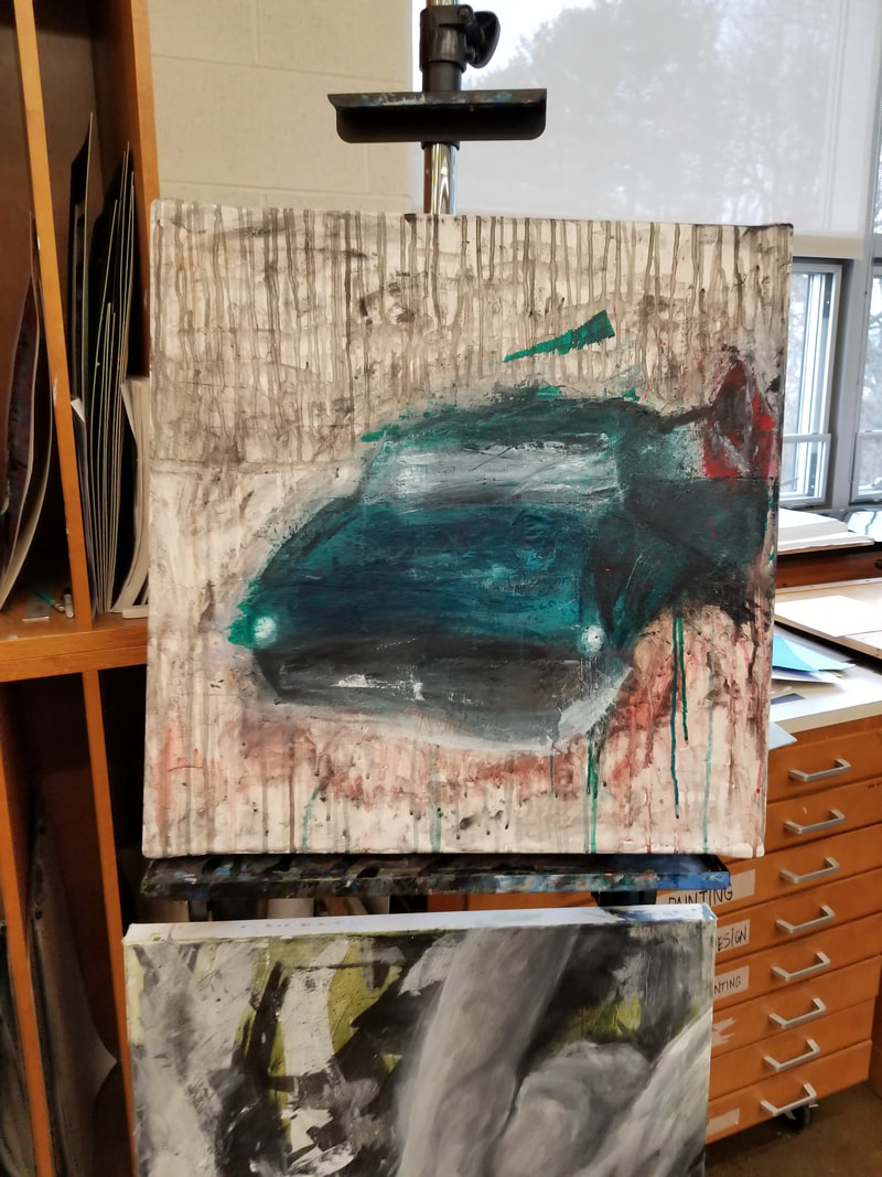
Okay so its a week later and I have got something to share. I gessoed over the painting and currently starting to redo a different image that I took while driving.
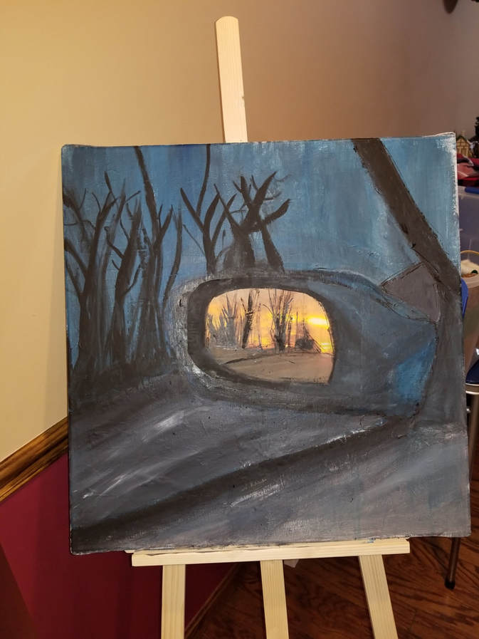
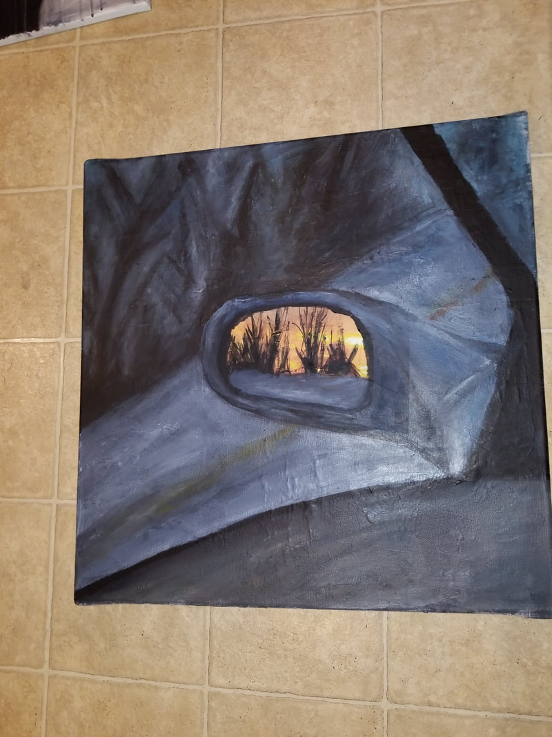
IIs there such thing as bad paint? I believe I'm either bad at painting, or nothing wants to turn out good for me. Here is another painting I tried to do but honestly it just sucks in my opinion. I feel like I can do better but the paint just doesn't want to cooperate with me like at all. I started with a graphite sketch over the gesso and then painted the background blue. I then painted the outline of the mirror and etc. I then Painted the reflection of the mirror. A reminder that this is all in acrylic. THE RED, ORANGE, AND YELLOW DECIDED TO BLEND ALL TOGETHER and create this crappy brown. But then I printed out the image and cut out the mirror and pasted it on the canvas. Then I painted the colors of the car and the road. finally I took a thick brush and crated trees. I still thing it looks like crap. I need massive feedback so I can do something over the upcoming 4 day weekend. It honestly looks like a 5 year old painted this.
|
|
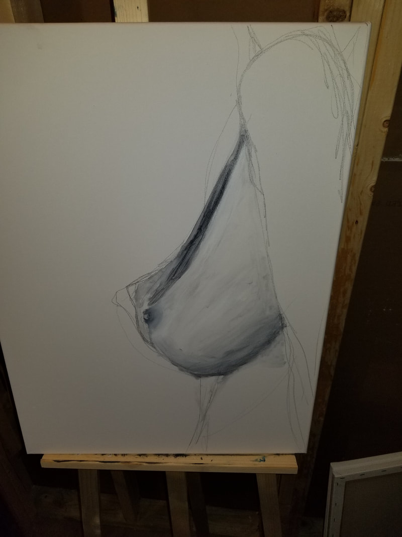
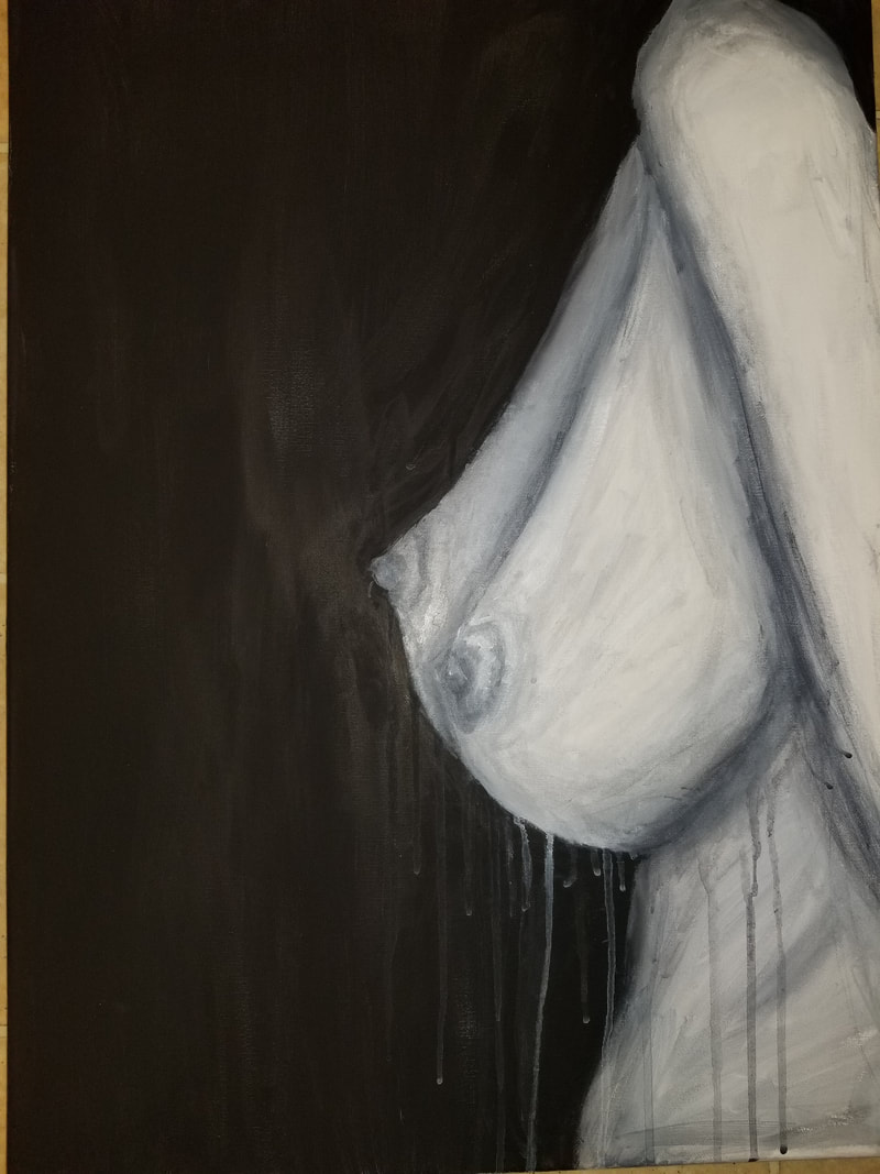
Hey! Wanna hear a good joke?.... My thought process for this observation topic. I get the whole observation theme and my ideas are good, but I am having a difficult time getting my ideas to work. I have done some more work to the painting with different paint because my paint wasn't as good. So I continued with the trees and got ideas on how to paint them because if you haven't noticed from my previous work, I don't really do landscapes or objects. I struggled so hard on this because I'm not used to this. I struggled so hard I did another painting and wanted to choose between the two. The painting I did is black and white acrylic on canvas. The black and white make the piece balanced. The position of the piece is proportional. The painting is of a nude woman (I'm sorry). It is just her chest area so it's difficult to tell what you're looking at.
|
|
Not going to lie, but I believe the second one is better but it does involve a good bit of nudity. I don't see nudity as a bad thing but my mind is completely different then what most of the other minds are. I believe this is powerful because the point across from this is if you don't think the human body itself is beautiful, are you really mature enough to handle anything?
Perspective
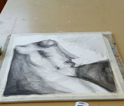
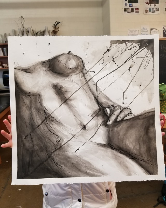
I have decided for my perspective is to do different views of perspective of nude figures. I mostly contribute to an abstract with a figure in my work and I plan id continuing that but from looking up from a body. I'm not sure how I'm going to do this yet but I plan more as I go on.
A week later and I've decided to do one nude female painting, looking up at her, on watercolor paper. There is a reference image but it's too "inappropriate" to share but I am taking it and making it a watercolor and ink wash painting. I have to use the right proportions to get this right because if they're wrong they are just going to look like nothing. I'm still working on the alignment the body. The lights and darks are to contrast each other but I soon plan to add some color to make it have a less boring feel. Savanah Manetta has influenced and helped a lot in this painting.
A week later and I've decided to do one nude female painting, looking up at her, on watercolor paper. There is a reference image but it's too "inappropriate" to share but I am taking it and making it a watercolor and ink wash painting. I have to use the right proportions to get this right because if they're wrong they are just going to look like nothing. I'm still working on the alignment the body. The lights and darks are to contrast each other but I soon plan to add some color to make it have a less boring feel. Savanah Manetta has influenced and helped a lot in this painting.
Okay, I'm back after a little with an update. I'm finnished with this piece! I have added and did a few different things. I added darker areas to the breast to create more depth in the figure. Then i was insprired by a painting I saw in Harrisburg and decided to loosen up a bit. I added lines to outline the figure more. Then i spilled in in the corner to show the the light angle and twist it up and make it dark drips of ink. I then took a brush full of ink and splattered over it. I actually believe I like this peice but yes, there are many things I could do to push it but I believe it looks best here.
Time
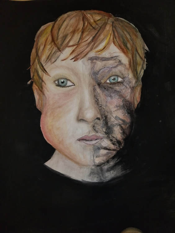
I didn't start it yet but I plan on making a young boy's face with acrylic paint and then collage older men faces onto the boy showing the time. the collage will give it an abstract feel and the collage will make the piece come together for the explanation of the theme
One wek later... I am currently working on this piece now due to working on previous assignments to get some out of the way. I have decided to do watercolor paint to
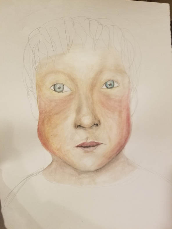
As I continue to paint this It take me at lease 3 hours to paint the face. I then thought to myself "how the heck am I going to collaged images in this?" So I was chatting with Mrs. MaClay and she helped me come up with the idea of wax paper over to create wrinkle like skin.
I put the paper on the one side of the face to make it look wrinkled and left the other side the same to show the youth. I then got into a deep start where I just realized that when you die, you're gone. It's the end. As you get older the dark comes. I made the background black and that symbolizes the darkness and when you get older your body gets taken over by darkness. the darkness is basically death. death is taking over yur body and as soon as it strikes, you are all gone. BAM! All you see is darkness.
I put the paper on the one side of the face to make it look wrinkled and left the other side the same to show the youth. I then got into a deep start where I just realized that when you die, you're gone. It's the end. As you get older the dark comes. I made the background black and that symbolizes the darkness and when you get older your body gets taken over by darkness. the darkness is basically death. death is taking over yur body and as soon as it strikes, you are all gone. BAM! All you see is darkness.
Expression
I chose this theme and this action of a man licking his armpit. I know what you're thinking.. Why? I chose this theme because I am slowly finding myself and through the process I do pretty stupid things to find out who am. That's hoe most teens and such are. They are uncertain so the go out and explore doing crazy shit. the man is expressing himself through the movement and action that he is doing. The principles are movement and emphasis. The message of the painting is to embrace your weirdness because soon it's going to make sense and the only person that will know their true self is you.
This is another difficult assignment. I put this to the side as well a few times and it's not as bad as some of the other ones. I used acrylic pain only for this and I used a collaged canvas that is not tight so it's very floppy, which is another thing that kinda bothers about this but it's not gonna stop me.
This is another difficult assignment. I put this to the side as well a few times and it's not as bad as some of the other ones. I used acrylic pain only for this and I used a collaged canvas that is not tight so it's very floppy, which is another thing that kinda bothers about this but it's not gonna stop me.
honestly, this was quite the challenge. I'm gonna call it from where I am at but I just had spend the last 4 hours trying to do this painting and for some how it just isn't cooperating but I think it's at a decent state right now where I can let it live. I will probably miss with some more over the weekend but yes, its completed for now. I am aware it's ugly but I shall not touch it, again, yet.
So I completed this finally and it's not my favorite but I am happy with the turnout and I believe it is very expressive and shows the strangeness of what I was going for. Looking at the painting makes me think about everything and I get mixed emotions about it.